IDSS Engine — Turning Forecasts Into Partner Decisions
NOAA Global Systems Laboratory · National Weather Service
UX DesignGovernmentData Visualization
The platform that tells a National Weather Service forecaster what the forecast means for one partner's event — a stadium, an airport, a wildfire crew — before the weather arrives. I have led its design since 2023, from a research prototype to a national release across 120+ forecast offices. It is the direct ancestor of AWARE.
Role
Lead UX Designer & User Researcher
Timeline
Jan 2023 – present
Team
6 core, across 3 organizations
Client
NOAA Global Systems Laboratory · National Weather Service
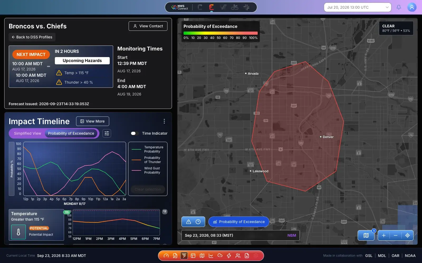
One monitored event, one screen. What's next and why at top left, when in the Impact Timeline below it, and where on the map — each criterion shown as the chance the partner's line is crossed, not a single guess.
Outcomes
120+
Forecast offices
The national release across National Weather Service forecast offices; v2.2.9 shipped September 23, 2026
3
Releases in 30 days
v2.2.7 on Aug 25, v2.2.8 on Aug 28, v2.2.9 on Sep 23 — each with plain-language release notes
2.82 → 7.45:1
Severity contrast
The moderate-severity token after a WCAG 2.1 and Section 508 audit — from failing to AAA
01 — Problem
A National Weather Service forecaster does not only forecast for a county. They support specific events: a Sunday night game at Empower Field, a city marathon, an airport's de-icing crew, a fire team on a ridge. Each of those partners has a line — the gust that brings tents down, the temperature that stops a race, the freezing drizzle that grounds flights — and each wants the same three answers. Will we cross our line? When? How sure are you?
For years, holding those lines was the forecaster's job and nobody else's. They lived in heads, in spreadsheets, and in phone calls. A forecaster would read the latest model run and translate it, partner by partner, into a yes or a no. For one event that works. On a busy summer weekend with a dozen events across an office's territory, it is exactly the part that breaks — not because anyone is careless, but because nobody can re-check twelve thresholds against every new forecast by hand.
The IDSS Engine exists to take that load. A forecaster writes a partner's line down once, as a DSS Profile, and the engine checks every new forecast against it around the clock. When I joined in January 2023, the engine already worked — in a lab. The science was sound. What was missing was a product a forecaster could trust on a real shift, and an answer a partner could read without a meteorology degree. That was the brief.
The project did not start with me. Here is where it came from — step through it:
Six years, five versions — select one
Event Portfolio prototype
A research prototype. Pick an event, pick an ensemble, and the engine works out when the weather crosses your line.
What it proved
An event can be written down as thresholds — snow over 6 inches, gusts over 10 — and a machine can compute when it starts and stops.
What it left open
It read like a lab instrument. Radio buttons, raw timestamps to the second, a "threat level" axis with no units, and a briefing that was an email button.
What carried forward
The event, its thresholds, and the onset and cessation times. Those three ideas survive in every version since.
1 / 5
02 — Research & Discovery
I started with what I had inherited rather than with a blank page. Two earlier versions existed, and I walked both of them with the people who had built them and then with forecasters. The exercise was simple: sort every idea into what it proved, what it left open, and what we should keep. Three ideas survived untouched, and they are still in the product today — an event described by its thresholds, a home screen organised by time rather than by name, and criteria written as sentences a person would actually say.
The finding that reshaped the product was about uncertainty. Forecasters speak in likelihoods: "a good chance of gusts over forty by mid-afternoon, less sure about the timing." That hedging is not vagueness. It is the most valuable thing they know. The earlier interfaces drew a single forecast line crossing a dashed threshold, which quietly asked the forecaster to throw that knowledge away. So the central question stopped being "will the forecast cross the line?" and became "how likely is it to cross, and is that likely enough for this partner?"
That second half matters because partners do not share a tolerance for risk. A stadium planning an evacuation needs lead time and will happily accept a false alarm. An airport pays real money every time it calls out a de-icing crew and wants to be sure first. Same forecast, same probability, different decision. The design had to let a forecaster set that bar per partner, per criterion, in words they would use — not as a statistics exercise.
The third thread was about the forecaster's day. Nobody supports one event at a time. The screen a forecaster opens first had to be organised around what is coming next across all of their events, with the most urgent at the top, rather than around any one dataset. And because research on a national product never really stops, I built the listening into the product itself: a feedback link on every screen, release notes that name exactly what we want tested, and a documentation site with video walkthroughs and a page for every display element.
Research activities
Heuristic walkthroughs of the 2020 and 2021 prototypes with their original builders and with forecasters
Contextual inquiry and usability testing with operational forecasters supporting real events
Testing focus areas published with every release: workflow fit, clarity of information, interface usability, and missing features
Continuous feedback through an in-product Submit Feedback link, a dedicated Slack channel, and a support inbox
03 — Design Process
Project phases — select one
Inherit & listen. Walked the 2020 prototype and the 2021 Situational Awareness Display with the people who built them, then with forecasters, sorting every idea into proved, open, or keep.
The first structural decision was to stop thinking of the Decision Support Display as a dashboard and start thinking of it as a set of answers. Every display element had to answer exactly one question a forecaster or partner asks. The Impact Summary answers what is next. The Impact Timeline answers when. The Planview Map answers where. The Risk Matrix answers how bad, across everything at once. Key Points and Hazards answers what do I tell them. If a proposed element could not name its question, it did not get space on the screen.
The Impact Timeline is where the uncertainty finding became interface. Its chart has been through three generations. In 2020 it was a "threat level" line on an axis with no units. In 2021 it was a single forecast value crossing a dashed threshold. In the DSD it became Probability of Exceedance: for each criterion, the chance, hour by hour, that the partner's line is crossed. A Simplified View stays one click away for the forecaster who wants a quick read. The next release goes further, removing an onset-window control that forecasters found confusing and relabelling the range of possible outcomes as a plain Percentiles View.
The Risk Matrix was a deliberate move from charts to a grid. Six criteria across twenty-four hours as line charts is six charts to compare in your head; as a grid it is one picture you can scan in a second. Colour carries severity on the five-level scale — Minimal, Minor, Moderate, Severe, Extreme — and a Show Values toggle puts the actual forecast number in every cell, so the colour is never the only way to read it. A forecaster can click any cell and override the engine's call when their own judgement disagrees, and one button puts every override back. The engine proposes; the forecaster decides. Missing data is its own cell state that says No Data, never a blank that could be mistaken for calm.
That severity scale had to hold up everywhere the product appears, in dark and light themes, for people who do not see colour the way I do. A WCAG 2.1 and Section 508 audit of the alert severity colours found the moderate-severity token at a 2.82:1 contrast ratio, well short of readable. I specified a corrected pairing at 7.45:1, which clears AAA, and the whole scale now lives as tokens in Nexus, the design system I built for NOAA's forecaster-facing applications. Fix it once, and it is fixed in every product that uses it.
In April 2026 I started building the design as a running application — React, HeroUI, Tailwind, and Leaflet over a Mapbox basemap, on mock data by design rather than by accident. It has more than 120 commits of mine, and its components carry the Figma node they were built from. It is where the next features get proven before engineering commits to them. The Save Profile button that stays disabled until the five required fields are filled was built and argued over there in July, and shipped in the national product in August. The multi-day Risk Matrix with 1-, 3-, 6-, and 24-hour steps, and cells that show probability and value together, are next in line the same way. The partner briefing was built there as a standalone module with its own handoff notes, so any NOAA application can lift it without rewriting it.
Sketches and wireframes from the work — click any of them to look closer:
Inherited · 2021 event detail
The concept I inherited. Criteria as a sentence and one small chart per criterion both survived. The model picker and the single-line charts did not.
Figma · event view
The DSD event layout in Figma. Summary, timeline, and map settled into the positions they still hold, and Probability of Exceedance replaced the single forecast line.
Figma · Weather Risk Outlook
Charts become a grid. Six criteria across a day in one look, No Data stated in the cell, and a Reset overrides button for when the forecaster has disagreed with the engine.
Figma · light theme
The same view in light mode with values switched on. The severity colours had to read in both themes, which is where the contrast audit started.
04 — Solution & Outcome
The IDSS Engine is three places a forecaster works: the Profile Dashboard to see every event they support, the Criteria Builder to describe a new one, and the Decision Support Dashboard to watch it and brief it.
The Profile Dashboard is organised around the forecaster's day. A calendar across the top shows when each monitored event starts, active and inactive profiles sit in separate tabs, and the cards are sorted by next impact by default so the most urgent event is always first. Each card carries a Next Impact panel with a start, an end, the criteria driving it, and a plain-language statement like "25% chance over the next twelve hours." Numbered badges on the cards match numbered markers on the map beside them, so a forecaster never has to guess which outline belongs to which event.
The Criteria Builder asks for five things and no more before it will save: a name, a time zone, a start, an end, and at least one weather condition. Everything else — venue, point of contact, expected attendance, evacuation lead time — is optional and can be filled in later. The area is drawn straight onto a map with pen, rectangle, or circle tools, or imported from an existing boundary file. Each weather condition reads as a sentence: Thunderstorms, wind gust, greater than 40 knots, for at least an hour. Advanced settings stay folded away until needed, and they are where a forecaster sets a partner's graduated impact levels and their probability bar — Cautious, Balanced, Confident, or an exact percentage. Features that are not ready yet are visible and marked Coming soon rather than hidden.
The Decision Support Dashboard brings the display elements together for one event, and its briefing tools turn the same working view into something a partner can read. Key Points and Hazards can draft up to three talking points from the current forecast for the forecaster to review, edit, or discard. Presentation View drops the analysis-heavy elements and keeps what a partner needs: the summary, the key points, and a full-width map. The briefing builder and the Risk Matrix both export to PDF, so the thing an emergency manager prints is built from exactly what the forecaster was looking at.
Key design decisions
Every display element answers one question — what's next, when, where, how bad, what do I tell them — or it does not get space on the screen
Probability of Exceedance over single forecast lines. The engine shows how likely a partner's line is to be crossed, not just whether one forecast crosses it
Each partner sets their own bar. Cautious, Balanced, and Confident presets turn a statistics question into a conversation a forecaster already has
Severity and likelihood are kept apart: colour says how bad, the threshold says how sure. Merging the two is how risk displays mislead people
The forecaster can override any Risk Matrix cell, and reset every override in one click. The engine proposes; people decide
Colour is never the only signal — values can be shown in every cell, the severity scale clears AAA contrast, and No Data is a stated state, not a blank
Only five required fields to save a profile. Everything else can wait until the forecaster has it
Briefings are assembled from the working view, never retyped, so what a partner reads cannot drift from what the forecaster sees
The whole engine, shrunk to one criterion. Move the threshold and the confidence and watch the answer change:
Try it — a DSS Profile in three decisions
Stadium event · Sunday · illustrative data
20tents come down around here60
Next impact4 PM → 9 PM
Gusts over 40 mph are very likely from 4 PM to 9 PM, peaking at a 91% chance around 6 PM.
Chance of exceeding 40 mph, hour by hour
3 · Read it as a Risk Matrix row
12p
1p
2p
3p
4p
5p
6p
7p
8p
9p
10p
11p
Minimal
Minor
Moderate
Severe
Extreme
Impact called
Colour says how bad the most likely gust would be. The outline says whether it is likely enough to act on. Keeping those two questions apart is most of what the Risk Matrix does.
The shipped product, view by view:
Profile Dashboard
The forecaster's day. Events on a calendar, sorted by next impact, and numbered to match their markers on the map.
Criteria Builder
Five required fields, a map to draw on, and conditions written as sentences. Impact levels and probability bars wait in advanced settings until they are needed.
Risk Matrix
The multi-day outlook, proven in the demonstration model first: day tabs, 1- to 24-hour steps, and cells that can show risk, probability, values, or both.
Key Points & Hazards
What the forecaster will actually say, one criterion per line, naming the impact rather than just the condition.
Briefing layout
The analysis falls away. Summary, key points, and a map zoomed in far enough to read — the three things a partner needs.
Briefing builder
A five-part briefing assembled from the event the forecaster is already monitoring, exported to PDF. Built as a standalone module so other NOAA applications can use it.
05 — Team & Collaboration
The team
6 core, across 3 organizations
DAUX design and user research lead (CIRA)Me
PL1 Project Lead (NOAA GSL)
UD1 UI Developer (CIRA)
SD2 Software Developers (CIRA)
DE1 DevOps Engineer (CIRES)
–D1–2 designers reporting to me, plus an intern
NFNWS forecasters across field offices as testers and reviewers
The only design lead on a team of engineers and atmospheric scientists, which meant design's job was translation in both directions: turning the science into something a forecaster could act on, and turning what forecasters told me into something an engineer could build. I own the Figma files, the research, and the display elements, and I manage the designers who help me carry them. Since April 2026 I also build the design as a running application, so the engineers who ship the product are working from something they can click rather than something they have to imagine.
06 — Reflection
Probability is easy to compute and hard to show. The engine can produce a percentage for every criterion, every hour, every model run, and almost all of it is noise to someone deciding whether to move twenty thousand people out of a stadium. The real design work was deciding which single question each screen answers and letting everything else fold away. The most useful thing the Risk Matrix does is keep "how bad would it be" separate from "how likely is it". Displays that merge the two tend to make people either panic or shrug.
The earlier prototypes were right about more than they looked. The 2020 version's onset and cessation times are the Next Impact card now. The 2021 version's time-first home screen is the Profile Dashboard. Inheriting a project well meant finding the ideas that already worked under an interface that did not, and keeping them.
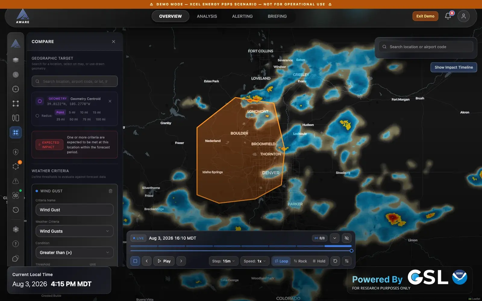
The IDSS Engine answers one kind of question: what does the forecast mean for this partner's event? AWARE, the product I am designing now, answers the question upstream of it: what is the weather doing, and what should the forecaster say about it? It starts from the hazard instead of the partner, and it deploys onto the same IDSS Engine infrastructure. Almost every idea that carried across — thresholds over an area over time, one severity scale, briefings built from the working view — was first tested with forecasters here.
What the IDSS Engine handed to its successor:
What carried into AWARE — select an idea
IDSS Engine · Criteria Builder
AWARE · Compare
The DSS Profile's core idea — a partner's line, a drawn area, a time window, evaluated against the forecast — is AWARE's Compare panel almost unchanged. What moved is where it starts. In the IDSS Engine the partner's event comes first and the weather is checked against it. In AWARE the forecaster's hazard comes first, and partner thresholds are one of the ways to test it.