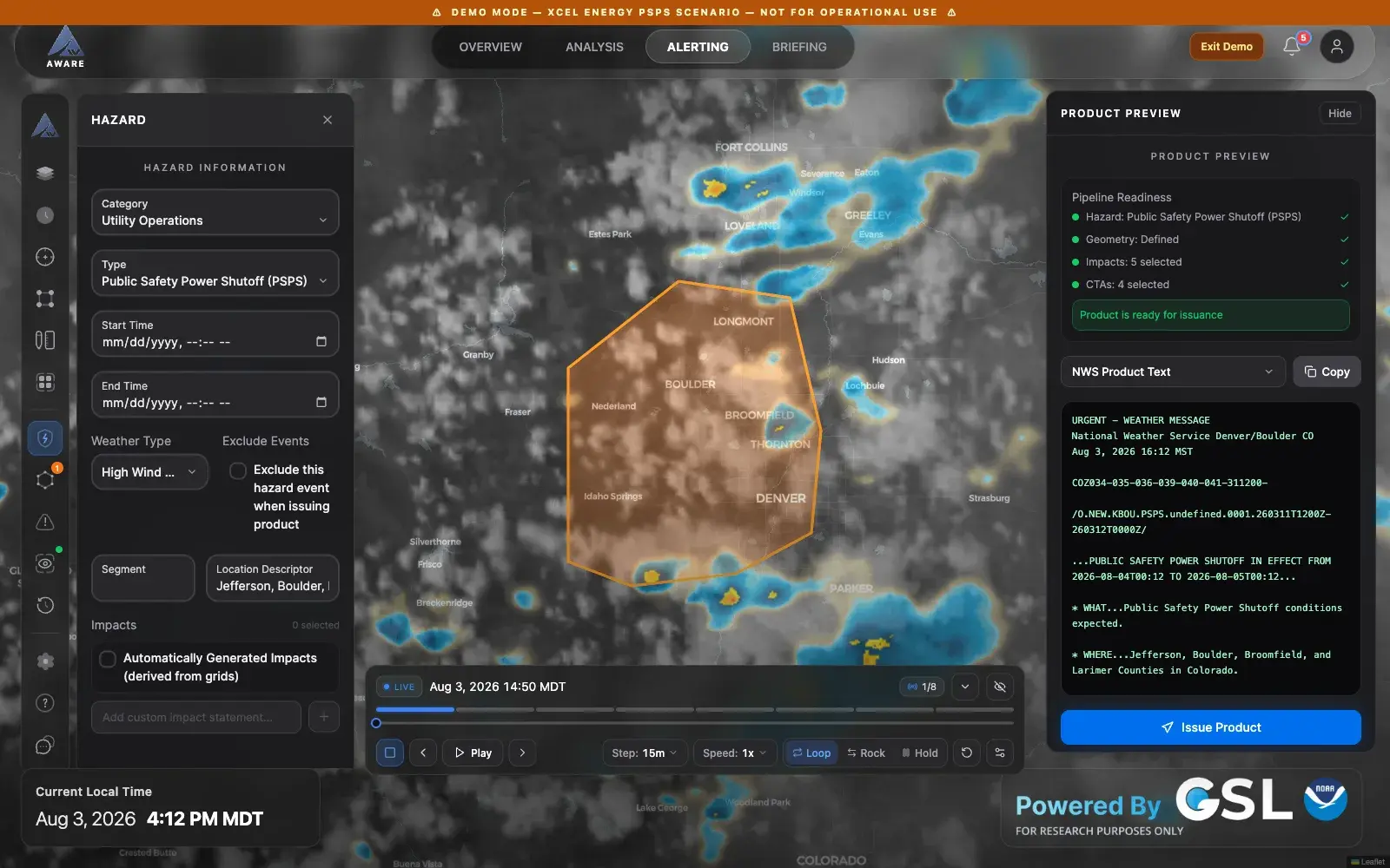
A decision-support workspace for National Weather Service forecasters that turns a live weather picture into an issued product and a partner briefing without ever leaving the map. Public research build shipped 10 releases in 14 weeks.
Role
UX Designer & User Researcher
Timeline
Apr 2026 – present
Team
4 core, across 3 organizations
Client
NOAA Global Systems Laboratory
The alerting workspace during the demo scenario. Authoring on the left, the drawn area on the live map, and the product text that will actually go out on the right — all visible at once, all editable in any order.
Hosted by NOAA GSL. Click Demo in the header to load the Front Range power-shutoff scenario. For research purposes only — not an operational NWS product.
Outcomes
10
Releases in 14 weeks
v0.0.1 in April 2026 through v1.14.0 in July, all publicly deployed
4 → 1
Modes on one live map
Watch, study, alert, brief — position, zoom, layers, and time survive every switch
24
Hazard types, one path
Six categories, from winter storm warnings to public-safety power shutoffs
01 — Problem
The National Weather Service does more than issue warnings. Under Impact-based Decision Support Services, forecasters brief the people who have to act on the weather — emergency managers, airport operations, utilities deciding whether to cut power to a canyon before the wind arrives. That work asks a forecaster to hold three things at once: what the atmosphere is doing, what it means for a specific partner, and what they are legally about to publish.
The tooling did not hold those three things together. A forecaster would read the situation in one system, reason about a partner's thresholds in a spreadsheet, and compose the product text somewhere else again. Every seam was a place to lose the map, lose the zoom, or lose the thread. During a wind event — exactly when the seams cost the most — I watched a forecaster rebuild the same view three times in twenty minutes because a tool had taken it away from them.
So the brief was not "make a weather app." It was: can one workspace carry a forecaster from noticing something to saying something, without ever making them start over?
02 — Research & Discovery
I started by watching rather than asking. Routine shifts first, to learn the baseline rhythm, then a live high-wind event where the pace changed completely. The most useful observation had nothing to do with data: forecasters treat their map the way a pilot treats an instrument scan. Position, zoom, and layer stack are working memory. Anything that resets them is not a minor annoyance, it is amnesia.
That reframed the whole project. The question stopped being "which screens do we need" and became "what has to survive when the job changes." The answer was the map, the clock, and the area you care about. Everything else could move.
A card sort with forecasters settled the data model. Given the full inventory of layers on cards, everyone grouped them by provenance — satellite, radar, surface, hazards — and nobody grouped them by appearance or by task. Six categories fell out unprompted, and that structure is the layer catalogue in the shipped product, including the groups we cannot serve yet. Those stay visible and dimmed, because a forecaster planning a shift needs to know what is coming as much as what is here.
The third thread was partner language. Interviewing on the utility side made the gap obvious: a forecaster says "sustained 40 with gusts to 60," and a utility operations lead hears nothing actionable until it is expressed as their threshold, their circuits, their decision window. The product had to translate, not just display.
Research activities
Shift observation across routine operations and a live high-wind event
Card sort of the full layer inventory with forecasters — six categories, unprompted
Threshold interviews with utility-side partners on how forecast language becomes a decision
Working sessions on hazard authoring against real National Weather Service product formats
Continuous feedback: an in-app feedback panel and a What's New panel that tells users exactly what changed
03 — Design Process
Project phases — select one
Field observation. Sat with forecasters and IDSS staff through routine shifts and one live wind event. Watched what they opened, in what order, and what they typed into other windows.
Lo-fi work answered one question: where does the forecaster live? I put three layouts on the wall. Option A kept one map with tools sliding over it. Option B made four modes that share a single map. Option C split the screen between map and data. C died in the room — half a map is half a map. A was close, but it had no honest home for a briefing. B won, and it became the four views the product ships with: Overview to watch, Analysis to study, Alerting to decide, Briefing to tell. The map underneath them never reloads. You change; it does not.
The second lo-fi study was the hazard path, and it is where I killed my own first instinct. I had sketched a modal wizard: pick a hazard, draw the area, choose impacts, confirm. Clean, familiar, and completely wrong — a wizard takes the map away at the exact moment a forecaster needs to look at it, and it forces an order onto work that genuinely loops. The replacement treats a hazard as one editable object rather than a sequence of steps. You can define the geometry before you have named the hazard, revise the valid window after you have read the draft text, and come back to any part of it at any time.
Mid-fi is where the arguments got specific. The alerting wireframe fixed three rules that survived to production: authoring docks beside the map instead of covering it; the raw product text is visible while you are still editing the thing that generates it; and a readiness checklist — hazard, geometry, impacts, calls to action — is the only gate on issuance, with every item stating its own status rather than failing silently.
The time controls got their own study, and they are the change I am most attached to. Playback started life inside a panel, which meant reaching for any other tool killed your animation. I designed a persistent bar that docks to the map across all three map views, in three states — expanded, collapsed to a pill, hidden to a single restore button — with the choice remembered between sessions. The panel and the bar share one source of truth, so playback, loop window, and scrub position can never disagree. Space plays and pauses, arrows step a frame, and both stand down while you are typing. That shipped in v1.14.0, along with a fix for the bug where the map and the controls fought each other for the animation and flip-flopped between two frames forever.
Because I was writing much of the front-end, the loop from sketch to running build was hours rather than sprints. That is the real methodological point of this project: the fidelity ladder still mattered, but the top rung was a deployed URL a forecaster could open, not a prototype I narrated over a call.
Sketches and wireframes from the work — click any of them to look closer:
Lo-fi · week 2
Three layouts on the wall. C died in the room. B won because it was the only one where the map — and the forecaster's place in it — survives a change of job.
Lo-fi · week 3
My own first instinct, crossed out. A modal wizard takes the map away at the worst possible moment and forces an order onto work that loops. A hazard became one editable object instead.
Mid-fi · alerting
The wireframe that fixed the rules: authoring docks beside the map, never over it; raw product text stays visible while you edit; and the readiness checklist is the only gate on issuance.
Mid-fi · layer IA
Straight out of the card sort. Six categories, grouped by where the data comes from, with unavailable groups shown and dimmed rather than hidden.
Mid-fi · time controls
Three states, one source of truth. Playback used to die every time a forecaster reached for another panel; this study is what shipped in v1.14.0.
04 — Solution & Outcome
AWARE is a single map with four ways to work on it, a tool rail down the left side, and a hazard that travels with you from first sketch to issued text.
The Overview is the watch floor: a live basemap with a catalogue of 16 available layers across satellite, radar, surface and aviation, and hazards — GOES imagery from NASA GIBS, radar from RainViewer and Iowa Environmental Mesonet, warnings and watches from the NWS API, convective outlooks from the Storm Prediction Center, SIGMETs and G-AIRMETs from the Aviation Weather Center. Active layers stack at the top of the panel, reorderable, each with its own opacity, and every choice persists so a returning shift does not rebuild the map.
Analysis turns the same location into a configurable dashboard — map, time series, sounding, and stat widgets you arrange yourself, with named templates for the recurring jobs (DSS triage, convective outlook, aviation) and layouts saved locally. Alerting is the authoring workspace: 24 hazard types across six categories, geometry drawn straight onto the map, impact statements derived from the forecast grids, live National Weather Service product text with its VTEC string, and a readiness checklist standing between you and the issue button. Briefing is the same event told to somebody else — situation overview, expected impacts, event timeline, partner actions, exportable to PDF.
Key design decisions
One map, four modes. Position, zoom, layer stack, and time survive every view change — the interface never makes a forecaster start over
Hazard as an object, not a wizard. Any step can be revised at any time, and the draft product text is visible the whole way through
Issuance is gated by a visible readiness checklist; nothing about the product's state is implied or silent
A persistent time bar shared with the panel, in three states, with keyboard transport — playback survives reaching for another tool
Layers we cannot serve yet stay visible and dimmed, so the roadmap is part of the interface instead of a document nobody reads
Failure is a designed state: a layer that cannot load says so in place rather than quietly drawing nothing
Every panel works down to phone widths — the nav folds to a drawer, the time bar folds its secondary controls into a popover, and touch targets grow
The shipped product, view by view:
Overview
The watch floor. Radar animating on the live map with the persistent time bar docked below it — frame counter, scrubber, transport, step size, and loop behaviour in one glance.
Layers
Active layers stack at the top with their own opacity and ordering; the catalogue below is the card-sort structure, with unavailable groups visibly marked rather than hidden.
Impacts & CTA
Forecast grids become partner language. Each impact statement carries a severity and a details view, and the forecaster keeps editorial control over every line that goes out.
Compare
Partner thresholds as first-class objects — gusts above 35 mph, humidity under 15% — evaluated against the forecast for a drawn area, so the answer is a decision rather than a chart.
Analysis
A configurable dashboard for the selected point. Map, chart, sounding, and stat widgets arranged by the forecaster, saved locally, with named templates for the recurring jobs.
Briefing
The same event, told to somebody who has to act on it. Executive summary, headline hazards, timing, and partner actions — exportable to PDF without retyping anything.
Phone width
Below 1193px wide — or 965px tall — the nav folds into a drawer and the time bar sheds its secondary controls into a popover. IDSS does not always happen at a desk.
05 — Team & Collaboration
The team
4 core, across 3 organizations
DAUX design and user research (CIRA)Me
UD1 UI Developer (CIRA)
SD1 Software Developer (CIRA)
DE1 DevOps Engineer (CIRES)
NFNWS forecasters and utility partners as recurring reviewers
The only designer on a four-person team, so design had nowhere to hide behind process. I ran the research, drew the interfaces, and then wrote a large share of the front-end myself — roughly three quarters of the human commits in the repo. Shipping my own designs meant every compromise was one I had to make in public, in code review, with the developer who would maintain it.
06 — Reflection
Designing for experts inverts the usual instinct. The reflex is to simplify, and here simplification is the dangerous move — taking away information a forecaster needs during a wind event has consequences that a bounce rate does not capture. The work is clarification: same density, less overhead, better ordering. Deciding what stays on screen turned out to be a harder and more valuable skill than deciding what to remove.
Shipping my own designs changed how I design. When you are the one writing the layer-loading code, you stop drawing states that pretend data always arrives. A large share of what I am proudest of here is unglamorous: the error state on a failed hazard feed, the pending state on a radar frame, the fact that the time controls now report PAUSED instead of continuing to claim LIVE while the map sits still. Those are design decisions. They just look like bug fixes in the changelog.
The thing I would tell my earlier self: the fastest way to settle a disagreement about an interface is to deploy it. Three of the biggest calls on this project — four modes over split screen, object over wizard, persistent bar over panel-only — were argued in the abstract for a while and then resolved in an afternoon by someone opening a URL and reaching for the wrong thing.