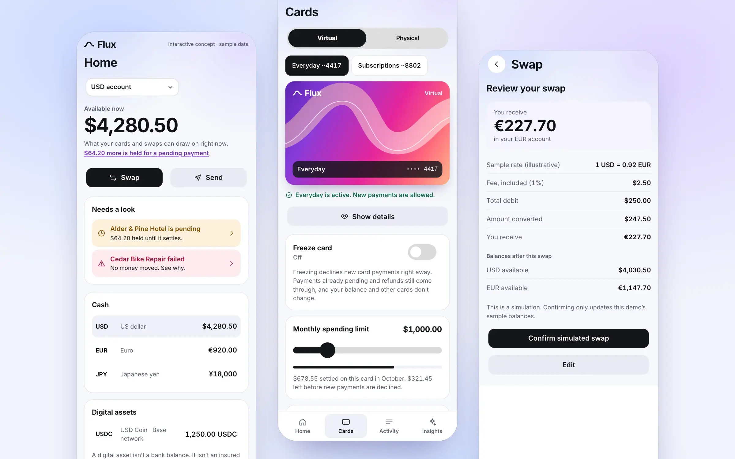
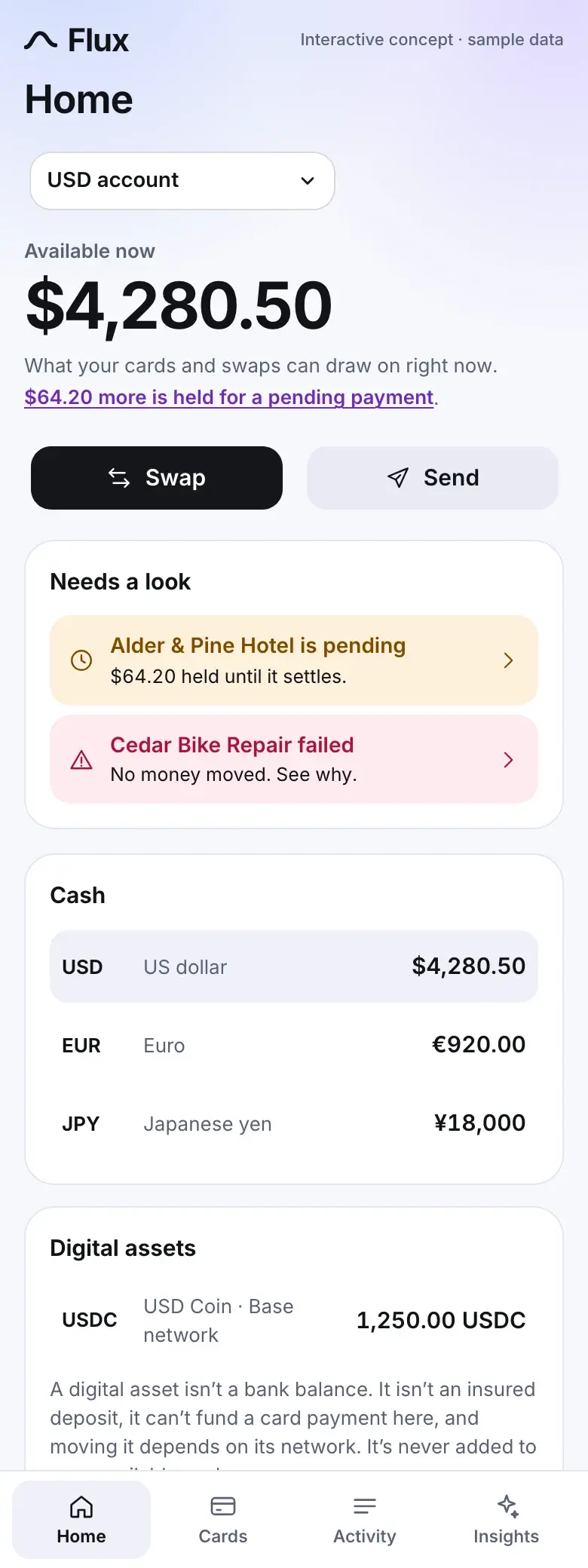
A self-initiated finance concept that brings balances, cards, activity, and currency exchange into one understandable experience. The central question is simple: can an app make money easier to manage without making the decisions behind it harder to see? Flux explores that through a mobile-first interface, a complementary desktop workspace, and explanations that only claim what their data supports. All of it runs on sample data.
Role
Product design & interactive prototyping
Status
Interactive concept, not a live financial service
Team
1
Client
Self-initiated · product concept
The first glance and the next layer: what's available now, a card you can control, and a swap laid out line by line before anything moves. Every screen here is a capture of the working prototype, on sample data.
Outcomes
4
Interactive workflows
Card controls, currency swap, activity and receipts, explained insights
2
Product layouts on one state
A phone layout and a desktop workspace; switch mid-task and nothing is lost
0
Actions the assistant can take
It explains. Anything that moves money or changes a card goes through the normal flow
This is prototype scope, not measured results. Flux hasn't been tested with customers and has no business outcomes to report.
01 — Problem
Checking a balance is straightforward. Knowing what that balance lets you do is a different job. Some money may be available now, and some may be held against a pending payment. A card might draw from one account while a currency swap uses another. A digital asset may sit alongside cash in the same interface, even though moving it involves a different set of conditions. The design problem begins when those distinctions disappear behind one attractive number.
For Flux, I wanted to explore the moment between seeing an amount and deciding to act. Someone freezing a card from a checkout line needs to know whether the freeze took effect. Someone exchanging dollars before a trip needs to understand the fee and the amount they will receive before confirming. Someone reading an AI insight about their spending needs a way to check the explanation against their own transactions.
The brief was to bring those decisions into one coherent experience. The interface should feel welcoming, but the details that change a decision need to remain visible. That tension shaped the concept: make the first glance simple, then make the next layer useful.
02 — Research & Discovery
Flux starts as a design hypothesis, not a completed research study. I have not validated the concept with customers or measured its effect on financial behavior. At this stage, the work is about making the assumptions explicit enough to prototype and evaluate.
I framed the experience around four situations: checking what money is available, controlling a payment card, understanding a transaction, and exchanging currencies. Each situation creates a different question, but they all depend on the same foundation: what information does someone need before they can act with confidence? The working audience is people who use mobile banking for everyday tasks and occasionally move between currencies or digital assets. That is a provisional definition. It gives the prototype a concrete starting point without pretending it represents everyone.
The sample data does some of the discovery work, because it has to hold up to questioning. I wrote it to include the awkward cases: a hotel authorization that holds $64.20 without settling, a card payment declined because the card was frozen, a transfer rejected by the other bank, and a charge whose only description is "SQ *KDM 0041." Each one forced a design question I would otherwise have skipped. What does a row show for money that never moved? What does an assistant say about a merchant it can't identify?
The next step is to put the flows in front of people with different levels of financial and crypto experience. The important observations would be where they hesitate, what they misunderstand, and whether they can recover without help. Those findings would determine what changes next.
What I would ask people to do first
Explain a balance in their own words, including the held amount
Freeze a card, then say what will and won't happen next
Identify the full cost of a swap before confirming it
Tell a pending payment from a failed one, and say what each did to their money
Check the evidence behind an AI insight and say whether they believe it
03 — Design Process
Project phases — select one
Frame the decision. List the moments between seeing an amount and acting on it: what's available, controlling a card, understanding a transaction, exchanging currencies. Each one sets what has to be visible before someone can act.
I organized the concept around decisions before organizing it around screens. Home needs to answer what is available and what needs attention. Cards needs to make control immediate. Activity needs to explain what happened. Insights needs to help someone understand a pattern without becoming another place they have to manage. Send and Swap sit in labelled quick actions close to the balance, rather than behind an unexplained center button in the navigation.
The balance design separates available money from the broader account picture, and I tried it three ways. A single total was the cleanest and the most misleading: adding yen and USDC to dollars implies a conversion nobody asked for, and suggests the whole sum can pay for groceries. So the top of the screen says "Available now" for one account at a time, with held money linked on the line below. Digital assets get their own section, with the network beside the amount and a plain note that they aren't insured deposits.
The swap flow uses progressive disclosure. The first view supports choosing currencies and entering an amount, with the arithmetic updating underneath. The review brings together the rate, fee, total debit, amount received, and both balances afterward. Editing returns to the existing choices rather than starting the task over. The amount field is the one place I stepped outside Jelly UI: its text input can't request a phone's decimal keyboard or tie an error message to the field across its shadow boundary, so that field is a native input styled to match.
The insight screen went through the same comparison. An open chat box was the obvious answer, and it promises more than the data can deliver: most of what someone might type is beyond two months of transactions, and each answer scrolls away from whatever backs it up. A feed of insight cards with a button on each was worse, because it places a one-tap decision exactly where the reasoning is thinnest. So Flux offers set questions, and each answer follows the same order: the claim, what it can't establish, the transactions behind it, then any action, kept apart.
Card management follows a different rhythm. Freezing a card is a direct control, so its state should be visible immediately. The card image desaturates and carries a Frozen label, the status line beneath it changes, and the explanation stays beside the switch: new payments are declined, while pending payments and refunds still come through. Jelly UI's tactile response stays on those deliberate presses. Balances and confirmations hold still.
Transaction rows had to stay compact without flattening their meaning. Each carries a title, date, category, amount and status, and the amount itself changes with the outcome. A settled payment shows a minus sign. A pending one shows no sign and says Held. A failed one is struck through, because writing a debit beside the word Failed asks someone to work out whether the money left. Row and receipt use the same language, so nothing has to be translated between them.
The visual system supports this hierarchy. Gradients give Flux its character, especially on the cards, and a single flowing ribbon runs from the wordmark to the card face. Neutral surfaces carry the information that needs precision. Card details sit on a dark plate, so the number stays readable across every finish. The desktop version preserves the same model while changing the arrangement: a persistent sidebar, a real table, and a side panel where a receipt opens with the list still in view. Both layouts read from one store, so switching mid-task loses nothing.
The layouts behind those decisions, and how the chosen ones turned out. Click either to look closer:
Concept explorations
Three competing layouts for each of the three decisions most likely to go wrong. They stay grayscale so the argument stays about structure: what is visible, in what order, and what sits one tap from what.
Wireframe to built screen
The hierarchy survived the move to color, because the gradients were never carrying the argument. They arrive on the card and the wash, while every value keeps a neutral surface and a label that says what the number is.
Three decisions, the layouts I tried for each, and the screen each one became. These are concept explorations, not a redesign of an existing product:
What goes at the top of Home?
Set aside. The cleanest screen and the least useful number. Adding yen and USDC to dollars needs a conversion nobody asked for, and it suggests the whole sum can pay for coffee.
Concept exploration · A · One total
Total balance
Everything, converted into one figure
SwapSend
USD
EUR
JPY
USDC
Activity
Activity
Where it ended up · the built screen
04 — Solution & Outcome
Flux brings the concept together through four connected demonstrations: card controls, currency exchange, transaction details, and explained insights. The card view pairs a distinctive visual identity with practical controls. A person can change the finish without losing the selected card, and freezing it changes the visible state wherever that card appears. The decorative surface is expressive; the control state is explicit.
Currency exchange centers on the amount that will leave one account and arrive in another. Enter $250.00 and the review shows a $2.50 fee, $247.50 converted, and €227.70 received at a labelled sample rate, leaving $4,030.50 and €1,147.70. Amounts are stored as whole minor units, so nothing drifts through floating-point rounding, and yen is handled as a currency with no decimals. Empty, malformed, negative and oversized amounts each get their own message beside the field.
Activity provides the record behind those actions. Completed, pending, and failed transactions have different meanings, so they receive different explanations, always in text and icon as well as color. A failed transaction says why it failed and what someone can do next, and its amount is struck through and marked Not charged rather than written as a debit. A pending payment explains the effect on available funds. A swap you confirm appears here as a new entry, with its own receipt.
The AI layer stays close to that record. The answers are prepared from the sample data rather than generated by a model, which lets every figure be tested against the transactions it cites. An insight offers a short explanation, identifies the transactions behind it, and provides a route back to them. When information is incomplete, the response says what it cannot establish: asked about "SQ *KDM 0041," it won't guess a merchant. That boundary matters, because a fluent answer can sound more certain than the data allows. Flux treats a response as something a person can inspect. Any action sits in a separate box and enters the normal flow, so the assistant has no way to move money on anyone's behalf.
These are prototype capabilities, not evidence of improved financial outcomes. The concept demonstrates how the experience could work. Whether it helps people understand fees, recognize transaction states, or judge an AI explanation still needs evaluation.
The whole prototype, running here on sample data. Everything stays on this page. Switch layouts mid-task and your state comes with you:
Loading the demo…
The questions a screenshot can't answer. Pick a screen and open a note:
123
"Balance" doesn't say what the number is for. "Available now" makes a promise the app can keep: this is what a card payment or a swap can draw on at this moment. The next line says what it means in plain words.
The states worth stopping on, captured from the same components as the demo:
Desktop workspace
A real arrangement rather than a stretched phone. With room to spare, the receipt opens beside the table, so comparing a pending payment against the rest of the month doesn't take any back-and-forth.
Card states
A finish changes how a card looks and nothing else. A freeze has to read differently: the color drains, a Frozen label appears on the card, and the status line beneath it agrees, so nobody has to infer the state from a switch position.
Swap: error, review, complete
The error names the actual limit rather than saying the amount is invalid. The review shows both balances afterward. Completion shows the new activity row right there, because that entry is how someone would find this swap again.
Three kinds of receipt
Each status answers a different question. Completed gives the record, pending says what happened to the funds, and failed gives the reason and the next step, and says outright that no money left the account.
Explanation and evidence
A $431.15 jump, and one $412.00 flight explains most of it. The answer says so, says what it left out and why, and opens the flight's receipt beside the explanation. Two months of data can't call it a one-off, so the answer doesn't.
Tokens and components
A small system with one firm rule: color gets to be expressive where nothing has to be read precisely. Controls come from Jelly UI, themed through its documented tokens, with the native amount field as the one companion component.
05 — Team & Collaboration
The team
1
DAproduct framing, interaction model, visual direction, and review of what gets builtMe
CCClaude Code — implementation against that direction, including the tests and browser checks
Flux is a solo, self-initiated project with AI-assisted development. I set the framing, the decisions and the visual direction, and Claude Code wrote the implementation against them, with Jelly UI providing most of the controls. Producing a screen quickly doesn't settle whether it communicates the right thing, so the review has to look at the wording, the arithmetic, and how states relate to each other. So far that means 17 automated tests on the money logic and state changes, plus scripted browser passes at five widths from 320 to 1440 pixels covering the workflows, keyboard focus and console errors. A real phone and a screen reader are still ahead.
06 — Reflection
The design question behind Flux is how much an interface can simplify without concealing something that matters. The concept takes a specific position: simplify the path, preserve the explanation. A fee can be easy to understand without disappearing into a final total. An AI insight can be brief while still linking to the transactions behind it. A card control can be immediate while clearly showing what changed.
Some of those choices have costs I'd want to watch. A review step adds a tap to every swap, and frequent users may come to resent it. Set questions are narrower than what people will want to ask. And Send is deliberately unbuilt: it opens a sheet saying so, because a control that looks finished and does nothing would undercut everything else here.
The next step is to test those decisions rather than assume the prototype proves them. I would evaluate whether people can identify their available money, explain the total cost of an exchange, distinguish a pending transaction from a failed one, and describe why an AI insight appeared. I would also take the complete flows through a real phone, a screen reader, enlarged text and reduced-motion settings with people who rely on them, because a scripted browser pass only shows that the structure is there.
The visual direction gives Flux a recognizable identity. The evaluation has to establish whether that identity supports an experience people can understand and control.
Tools Used
Next.jsTypeScriptJelly UICSS container queriesNode test runnerPlaywrightClaude Code