DataOrbit — Gridded Science Data, One Drag From a Globe
Self-initiated · NOAA Global Systems Laboratory context
Data VisualizationDesign EngineeringAgentic Coding
A browser-only viewer for NetCDF model output. Drop a 220 MB forecast grid on the page and its field is on a 3D globe in under a second — no Python, no server, and the file never leaves the machine. Around 2,250 lines across 14 modules, built solo in two concentrated agent-paired sessions five months apart.
Role
Design & Build (solo)
Timeline
Apr – Sep 2026
Team
1
Client
Self-initiated · NOAA Global Systems Laboratory context
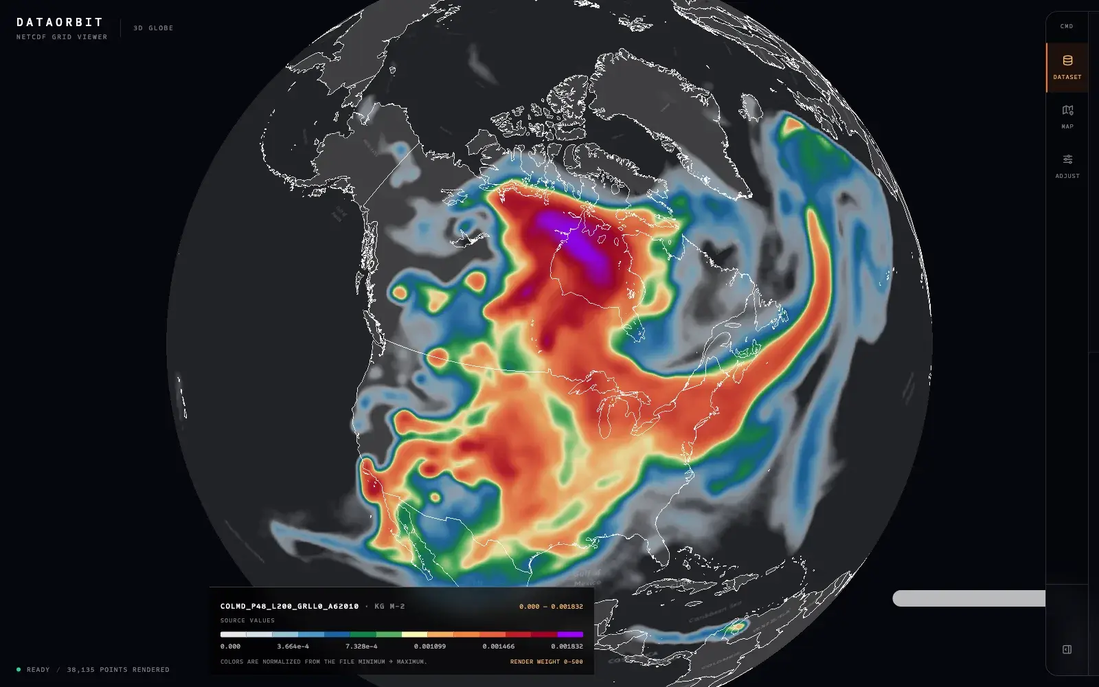
A 220 MB RRFS-A forecast grid, 980 milliseconds after it hit the page. Column-integrated smoke mass density across North America, with the command drawer folded away to the rail so the field gets the whole screen.
Drop a NetCDF file on the page, or paste a URL to one. Either way it is parsed in your browser and never uploaded, so nothing you open leaves your machine. Needs a desktop browser with WebGL.
Outcomes
980 ms
File to first paint
A 220 MB RRFS forecast grid parsed, subsampled and drawn — client-side, measured on the shipped build
14.4M → 38k
Grid cells to drawn points
And the panel names the 322-cell stride it used, so a subsample never passes for the full grid
~2 hrs
For the interface rebuild
Command drawer, a second file format, and a token-based style system, in one agent-paired morning
01 — Problem
Atmospheric science runs on NetCDF. Model output, satellite retrievals, reanalysis — it all arrives as gridded binary files with coordinate arrays bolted to the side. Researchers at a lab like GSL open dozens of them a week, and the questions they are asking of most of those files are embarrassingly simple: did the model actually write the field I expected, is the domain right, does this plume look physical, is this file worth the next hour of my time.
The standard path to that answer is a Python notebook — an environment, xarray, cartopy, matplotlib, and several minutes of code to produce a static PNG. That cost is entirely reasonable when the output is a figure going into a paper. It is absurd thirty times a day for a question you will forget the answer to in five minutes. And the notebook is unshareable: a colleague without your environment cannot open your look at the data, only your picture of it.
So two very different jobs had been collapsed into one toolchain. Publication figures need precision, reproducibility, and control over every axis. Quick looks need to be instant, disposable, and interactive. The quick look is the overwhelming majority of daily use and it had inherited none of its own tooling. DataOrbit is only the second job.
02 — Research & Discovery
I did not run a study for this one. I was the user, and the discovery was mostly a matter of catching myself in the act — noticing how often I opened a notebook to ask a question I would have preferred to point at, and how often the answer was "the file is fine, move on."
Watching how the files actually behave mattered more than watching people. I pulled a spread of real ones: an RRFS-A 3 km North America forecast at 220 MB with a 2961 × 4881 curvilinear grid, and GridSat GOES imagery at 4 MB with six separate channels on a regular lat/lon grid. Those two files disagree about almost everything — container format, grid geometry, variable naming, dimension order, how missing data is flagged, whether values need a scale and offset applied. Any tool that only handled one of them would be a demo rather than something I would reach for.
The constraint that shaped the architecture came from the context rather than the code. This is government atmospheric data, and the reflexive institutional question about any new tool is where the data goes. The answer had to be nowhere. That is not a technical flourish — it removes an entire category of conversation, and it means the tool works on a laptop on a plane. It also meant every hard problem became a browser problem: parse hundreds of megabytes of binary in JavaScript, hold fourteen million grid cells in memory, and get to a first frame before the user gives up on it.
The last finding was about trust, and it is the one that ended up driving the interface. A viewer that quietly downsamples a grid is worse than no viewer, because it will eventually let someone conclude something false about a field they never actually saw. Whatever the tool did to the data, it was going to have to say so on screen.
What set the constraints
Real files as the test set from day one — a 220 MB RRFS forecast grid and multi-channel GOES satellite imagery, not fixtures
Two container formats that share a name and almost nothing else: NetCDF3 classic and NetCDF4, which is HDF5 underneath
Curvilinear model grids, where latitude and longitude are full 2D arrays rather than axes — the case most quick-look tools get subtly wrong
No upload, ever: government data, so parsing had to happen client-side or the tool would not get used
Scientific integrity as an interface requirement — any subsampling has to be visible, named, and quantified
03 — Design Process
Project phases — select one
Engine. April 8–9. Parser, grid-shape detection, subsampling, and the heatmap tuning that ate most of the two days. Four commits, and every hard numerical problem in the project was found and fixed inside them.
The first session built the engine, and its whole method was: specify precisely, let the agent write the mechanism, then verify against a real file rather than a fixture. That last step is what keeps the loop honest. Fixtures agree with whatever you assumed when you wrote them; a 220 MB production forecast grid does not, and it found every wrong assumption I had about dimension order, fill values, and how much a browser tab will tolerate before it dies.
Three visualization problems took nearly all of the two days. The first was the polka-dot failure. MapLibre's heatmap blur radius is specified in screen pixels, but NetCDF data sits on a fixed geographic lattice — so the on-screen distance between neighbouring cells changes with every zoom step. Zoomed out, the cells crowd together and any radius looks continuous. Zoom in and they separate, and the moment the radius drops below the on-screen cell spacing the kernels stop overlapping and a smooth atmospheric field shatters into a visible dot grid. The fix is to let the data set its own floor: project two adjacent grid points, measure the pixel distance between them, and enforce that spacing as the minimum blur at the current zoom. The grid's own geometry decides how much blur it needs.
The second was a bug I would never have predicted and could only have found by shipping. Under MapLibre's globe projection, a compound expression on heatmap-radius — anything with a nested max or multiply — can silently fail and blank the entire map. Not error, not warn. Blank. The workaround is to give up on expressing the radius curve declaratively and instead precompute it in JavaScript as a flat fourteen-stop interpolation, one value per zoom level. It is less elegant and it is the only version that renders. That is now a comment at the top of the colour module, because it is precisely the kind of finding that evaporates from a context window and costs a full afternoon to rediscover.
The third was a decision to be slower on purpose. The obvious way to draw a grid is to rasterize it into an image and warp that image to four corner coordinates — fast, and what most tools do. It is also wrong for curvilinear model grids. RRFS and WRF grids are rotated and projected, so their cells are not axis-aligned quadrilaterals, and an affine warp to four corners tears them into large triangular artifacts that look like real atmospheric structure. So the renderer emits GeoJSON points and pays for it in memory, because a slower correct picture beats a fast lie. Every one of those three findings lives in the source as a comment explaining the failure it prevents.
The second session, five months later, was interface work. The engine was sound but it was wearing a plain sidebar with every control stacked in one scrolling column, which is what a tool looks like when it has only ever been used by the person who built it. I explored layouts on a generated canvas, then rebuilt around a command drawer: an icon rail with three destinations — Dataset, Map, Adjust — that collapses to just the rail so the data gets the whole screen. One job per destination, and inside Adjust a single-open disclosure pattern where each collapsed group still shows its own state in the header, so "18.0px · adaptive" and "45k points" are readable without opening anything. The same session added the NetCDF4 path through h5wasm behind the existing parser interface, and replaced the stylesheet with design tokens. Command drawer, a second file format, and a token system, in about two and a half hours.
04 — Solution & Outcome
DataOrbit is one full-bleed map, a collapsible command rail, and a legend. There is no dashboard chrome, no navigation, and nothing between the drop target and the answer.
Drop a file and the app sniffs its first eight bytes for the HDF5 signature to decide which parser to hand it to, finds the coordinate variables by name across the naming conventions in the wild — gridlat/gridlon, XLAT/XLONG, plain lat/lon — infers whether the grid is 2D, time × 2D, or time × level × 2D, and ranks the remaining variables to pick a sensible default field so that something is on screen before you have touched a control. On the 220 MB RRFS grid that whole path takes 980 milliseconds from drop to first paint, entirely in the tab.
The rendering controls are where the visualization thinking is visible. Smoothing radius carries an adaptive floor derived from the grid's own cell spacing, so the polka-dot failure cannot be reached by dragging a slider; detail boost lowers that floor at higher zooms when you want to see small features; and a no-smoothing switch exposes the raw kernel for anyone who wants to see the sample locations themselves. The point budget is a control rather than a hidden constant — 20k to 250k, and moving it re-parses the file, so the trade between fidelity and memory is the user's to make explicitly. The colour ramp is a fifteen-stop density scale that follows the convention already used for column mass density in operational meteorology, because the people this is for can already read that ramp and should not have to learn a new one.
The legend closes the loop back to science. Internally the heatmap works in a normalized 0–500 render weight, which is meaningless to a researcher, so every tick is converted back into the file's own units — 0.000 to 0.001832 kg m⁻² — and the footer states plainly that colours are normalized from the file minimum to maximum. You are reading the data, not the shader.
Key design decisions
The map is the application. Every control writes to a live MapLibre instance through paint-property updates — changing basemap, projection, variable, or any slider never tears down and rebuilds the map, so your position and zoom are never taken away from you
Subsampling is disclosed, never silent. "A 322-cell stride keeps rendering within the 45,000 point budget" sits in the panel next to "38,135 / 14,452,641", so a subsample can never be mistaken for the whole grid
The data sets the minimum blur. On-screen cell spacing is measured by projecting adjacent grid points, and that becomes the radius floor — the field cannot be made to break into dots
Correct over fast: GeoJSON points instead of a warped raster, because affine warping is wrong for curvilinear model grids and produces artifacts that look like weather
Failure is a designed state. Too large names the file's size in megabytes and suggests cropping the domain or taking a single timestep; no coordinates lists the variables it did find; wrong format says so in one sentence
The point budget is a user control, not a constant — the fidelity-versus-memory trade is made explicitly by the person who knows what the file is for
One collapsible rail, three destinations, and collapsed groups that still report their own state — the whole interface folds away to give the data the full screen
The shipped product, view by view:
Empty state
Before anything is loaded there is still a globe, a drop target, and one line saying what the tool expects. No splash, no tour, no sample dataset carousel — the fastest possible path to your own file.
Dataset readout
The most important panel in the tool. Model grid 2961 × 4881, 38,135 points drawn out of 14,452,641, and an explicit note that a 322-cell stride was used to stay inside the budget. Nothing about what happened to the data is left implied.
Rendering controls
One group open at a time, and every collapsed group still reports its own state in the header. The radius hint changes with the data: on a structured grid it tells you the blur is being sampled from cell spacing to keep gaps from opening up.
2D · satellite
The same data, same session, different frame of reference. Switching projection or basemap repaints the live map instead of rebuilding it, so the view you had built up survives the change.
Map commands
Everything about how the world is drawn, in one place and separate from how the data is drawn. Attribution for the tile sources sits in the panel rather than hidden behind an info icon.
Failure state
Designed, not defaulted. Every failure path names what was actually wrong and offers the next move — an oversized file gets told its own size in megabytes and advised to crop the domain or take a single timestep.
Phone width
The command drawer becomes a bottom sheet and the rail moves to the bottom edge. Same controls, same disclosure behaviour — the layout changes, the model does not.
05 — Team & Collaboration
The team
1
DAthe problem, the design, the visualization work, and every line of the codeMe
Solo, and deliberately agent-paired. I wrote the specifications, the interface decisions, and the acceptance criteria; the agent wrote most of the mechanism. What that changed is where my hours went — almost none on boilerplate, almost all on the two things an agent cannot do for you: deciding what the tool refuses to be, and staring at a wrong-looking render until I understood why it was wrong. Every non-obvious constant in the source now carries a comment saying what it defends against, because in an agent workflow the comment is the only part of your reasoning that survives into the next session.
06 — Reflection
A MapLibre heatmap is a density estimator rather than a field renderer — it accumulates overlapping kernels. For sparse, high-dynamic-range fields like smoke or precipitation that is close to ideal, and the results are genuinely beautiful. Dense, uniform fields behave differently: load GOES infrared brightness temperature, where every cell carries a high value, and the accumulation saturates the top of the ramp no matter how intensity is set. The next layer mode draws actual grid cells instead of kernels, and the codebase already carries a layer-mode concept to hang it on.
The most transferable thing I learned is about comments, of all things. Working with an agent, the code arrives faster than the understanding does, and the understanding is what you lose. Three of the sharpest decisions here — the radius floor, the globe projection workaround, the refusal to warp a raster — look like arbitrary constants and awkward code if you meet them cold. Written down as the failure each one prevents, they are the actual asset. The agent produced the lines; the comments are the part that is mine and the part that keeps being useful.
The other lesson is about scope, and it is the reason the tool gets used. DataOrbit does not do time series, reprojection, arithmetic between fields, animation, or export. Every one of those was tempting and each would have made it a worse answer to the only question it exists for: what is in this file, and does it look right. Two days of engine and one morning of interface is not a small project because I was clever about it — it is small because it stayed refused. Building fast with an agent makes that discipline harder, not easier: when a feature costs an hour instead of a week, the argument for saying no has to come from the design rather than the budget.