The Gardner's Inc. — A Landscaping Site That Asks for the Job
The Gardner's Inc. · Greater Thurston County, WA
Web DesignConversion UXUX Strategy
A family landscaping company with 45 years of work behind it, and a Wix site that showed none of that work and had no way to request a quote. I redesigned and rebuilt it in one week, from brief to launch, around a single job: turn a visitor into a qualified quote request. The owners report a 200% increase in outreach and conversions since launch.
Role
Design & Build (solo)
Timeline
Apr 2026 · one week
Team
1, plus the owners
Client
The Gardner's Inc. · Greater Thurston County, WA
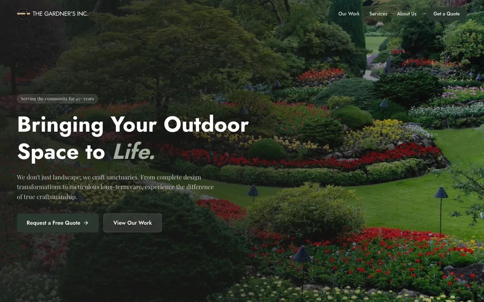
The first screen answers the first question: is this the kind of result I want? An outcome headline with one word in the serif accent, the 45-year badge above it, and two doors of different weight: quote now, or see the work first.
This is the live site. The quote form sends a real request to the company's inbox, so look around, but please don't submit a test.
Outcomes
+200%
Outreach and conversions
Reported by the owners after launch, measured against the Wix site it replaced
1 week
Brief to finished site
Thursday to Wednesday, by the commit log: design, build, CMS, email delivery, and gallery
0 → 6
Paths to a quote request
The old site had no form. The new one has six doors to it, and one stays on screen for the whole scroll
01 — Problem
The Gardner's Inc. has been landscaping in Thurston County, Washington since 1980: design and installation, irrigation and hardscape, and year-round maintenance for homes and commercial properties. It is a company that has spent 45 years producing exactly the kind of evidence a website is good at showing, and its website showed none of it.
The old site was a Wix template. Its hero was a heading saying "Welcome to The Gardner's Inc." over a background image. Its three service sections were paragraphs beside decorative image blocks, with not one photo of a finished yard. Its only button was "Explore Our Services", which scrolled down the page. The single conversion mechanism was a red marquee repeating CALL TODAY AND SCHEDULE A FREE QUOTE. There was no form anywhere. I checked the markup and found zero form elements. A homeowner browsing at nine in the evening, when a lot of that browsing happens, had no way to raise a hand.
That is not a cosmetic problem. A landscaping job is a considered purchase, often in the tens of thousands, and the buyer is comparing two or three companies before calling any of them. A site that looks dated, shows no work, and only accepts phone calls during business hours loses that comparison before the company knows it was in one.
02 — Research & Discovery
There was no research budget, and a one-week project doesn't leave room for a study. What there was: a live site to take apart, a company that knew its own customers well, and a clear picture of how people choose a contractor for their own yard.
The teardown came first because it is fast and it is factual. I went through the old page as a visitor would and wrote down what a visitor could actually do on it: read three paragraphs, scroll, or call. Then I wrote down what was worth keeping. Three real client testimonials, the phone number, the 1980 founding story, and a service grouping into design, irrigation and hardscape, and maintenance that was already right. The raw material was good. It had no structure and no exit.
The buyer's side is well understood, and it shaped every section. A homeowner hiring a landscaper is trying to answer a short list of questions in order. Is this the kind of result I want? Can I trust these people on my property? Do they do my kind of job? What does working with them look like? And finally, what will it cost? Each of those questions became a section of the page, in that order.
The last input was the photographs. The owners had years of real job-site photos: finished commercial beds, terraced lawns, an irrigation trench mid-install. None of them were on the old site. Those photos became the proof layer of the new one.
What set the constraints
A teardown of the old Wix homepage: one scrolling button, a phone number, no form, and no photographs of finished work
The owners' brief: locally owned, 45 years, craftsmanship, residential and commercial, and a tone that is confident without being salesy
How homeowners actually hire: compare two or three companies, look for proof, and only then ask for a price
A real library of job photos, which meant the portfolio could be real instead of stock
A small business as the long-term owner: no developer on staff, so the content had to be editable without one
03 — Design Process
Project phases — select one
Brief & structure. Tore down the old Wix page, wrote the brief, set the scroll order and wireframes, then generated the first build from the Figma design with Figma Make. It was committed at 6:23pm.
I wrote the brief before I drew anything, and I wrote it as a specification rather than a mood board. It covered the brand position, eight sections in a fixed order with the job of each, the calls to action, and the UX requirements: mobile-first, a persistent quote button, a short form, fast images, and real photography over stock wherever possible. The brief is the most valuable artifact in the project because it is what made the speed possible. When the structure is decided in words, generating the first build is a production step, not a design step.
Lo-fi was about order. I sketched the page as a sequence of questions rather than a stack of sections, and marked every place a visitor could leave for the quote form. The obvious alternative was a conventional multi-page site with separate Services, Work, and About pages. I didn't build it. Every page break is a place to drop off, and someone comparing three landscapers will not click five pages deep into each. A single scroll keeps the argument continuous and keeps the form one gesture away. It is also what made a one-week build realistic without cutting anything that mattered.
Mid-fi was about hierarchy, and it stayed grey on purpose so the decisions could be judged without colour or photography doing the persuading. Three calls were locked here. First, the hero gets two doors of different weight: a solid Request a Free Quote for the visitor who is ready, and a ghost View Our Work beside it for the one who isn't. Second, every service card answers the same three questions in the same order (what it is, what's included, who it's for), so a visitor can qualify themselves before they ask. Third, each card carries its own quote button, because the decision happens at the card and the action should be there too.
The quote form got its own wireframe because it is the only part of the site that earns money. The question was how little to ask while still producing a lead worth calling back. The answer was six fields, five required, and two of them are doing real work. Project type and budget are both dropdowns, so there is no typing on a phone. Together they tell the owners, before anyone picks up the phone, whether this is a $3,000 cleanup or a $40,000 terraced yard. The phone number stays beside the form, set large, and is a tap-to-call link on mobile. The form added a channel. It didn't take the old one away.
The visual layer came last and came from the company's own register: a deep forest green, a sage secondary, warm off-whites, and a pairing of Jost for structure with Playfair Display for voice. One word in the hero headline takes the serif italic, so the brand has a tone in six words without a single adjective about quality. The whole palette lives in Tailwind v4 design tokens, so it is applied consistently rather than remembered.
The build ran on the same principle as the brief: my time goes into decisions, and the agent's time goes into mechanism. Figma Make turned the Figma design into a working React and Vite codebase on Thursday evening, and every section was reading from Sanity within two hours. On Friday, paired with Claude Code, I wired the quote form to a Netlify Function that checks the required fields and sends the lead through Resend. I deployed Sanity Studio for the owners, removed the generator's leftover code and unused UI library, and tuned Netlify for long-lived asset caching and non-blocking fonts. Monday and Tuesday were refinement. Wednesday morning was the project gallery, in three small pull requests.
Sketches and wireframes from the work — click any of them to look closer:
Lo-fi · teardown
What a visitor could actually do on the old site: read, scroll, or call. There was no form in the markup at all, which set the brief in one line: show the work, earn the trust, and let people ask without picking up the phone.
Lo-fi · scroll order
The page as a sequence of questions, ending at 'OK, how much?' The multi-page site map was the obvious alternative and never got built, because every page break is a place for a comparison shopper to leave.
Mid-fi · homepage hierarchy
Hierarchy locked in grey, before colour or photography could do the persuading. Service cards answer the same three questions in the same order, and each one carries its own quote button.
Mid-fi · quote form
Six fields, and two of them do the first sales call. Project type and budget arrive with every request, so the owners know what they are calling back about before they dial.
Build · the stack and the week
Thursday to Wednesday, by the commit log. The stack was chosen so a small business owns and runs the site: static hosting, a CMS the owners edit themselves, and leads delivered to an inbox they already check.
04 — Solution & Outcome
The finished site is one page that argues in the order a homeowner decides. First the result, in a full-bleed hero with the 45-year badge above an outcome headline. Then trust: licensed and insured, award-winning design, satisfaction guaranteed. Then the three services as self-qualifying cards, and six featured projects in the company's own photographs. Then a four-step description of what happens after you ask, then testimonials beside a nine-photo gallery, then the founding story. The quote form comes last, where the argument ends.
There are six doors to that form, and a visitor is never more than one gesture from one. The navigation goes solid on scroll and carries a filled Get a Quote button down the whole page. The hero has one, each service card has one, and the form itself sits at the bottom. On a phone, the menu collapses to a sheet whose largest element is Get a Free Quote, and the company phone number is a single tap.
A quote request is a qualified lead the moment it arrives. It lands in the company inbox with the project type, the budget band, and reply-to set to the customer, so responding is just hitting Reply. There is no CRM to learn and no dashboard to check, which matters for a business whose people are out on job sites all day.
The owners run it without me. Nine Sanity content types cover everything from the hero copy to the gallery, and the CDN cache is off, so an edit in the Studio is on the site at the next page load. Every section also carries fallback copy in the code, so the page still renders if the CMS is ever unreachable.
Key design decisions
A quote form where there was none. Six fields, five required, and the two dropdowns (project type and budget) qualify the lead before anyone calls back
Six paths to the form, including a filled quote button that stays in the navigation for the whole scroll
Real job-site photography for the portfolio and gallery, because a landscaper's product is how the yard looks afterwards
One page in decision order (result, trust, fit, proof, process, reassurance, ask) instead of a multi-page site with a drop-off at every link
Service cards that answer the same three questions in the same order, so visitors qualify themselves
The phone number kept first-class beside the form and tap-to-call on mobile, so the new channel adds to the old one instead of replacing it
Content the owners edit themselves in Sanity, with hard-coded fallbacks so the page never renders empty
A static build on Netlify with lazy-loaded sections and immutable asset caching: no servers to patch and no website-builder subscription
The shipped product, view by view:
Trust
The second question is whether you can let these people onto your property. Licensed, recognised, and guaranteed are answered in one band, straight after the hero and before any selling.
Services
Three services, not ten, and every card follows the same structure: what it is, what's included, who it's for, then a quote button right where the decision gets made.
Featured projects
The proof the old site never showed. Real job-site photos, each labelled with the service it represents, so a visitor can match a project to the card they were just reading.
How it works
What happens after you ask, in four steps. The first promises a reply within 24 hours, and that one sentence takes the risk out of filling in the form.
Testimonials & gallery
The three testimonials the old site already had, now next to nine more job photos. The gallery scrolls on its own and opens into a lightbox, and it shipped in under an hour on the last morning of the build.
About
The founding story, from one truck and a push mower in 1980, placed just before the ask. By this point the visitor has seen the work, so the history reads as reassurance rather than as a sales pitch.
Quote form
Where the argument ends. Inline validation under each required field, the phone number set large beside the form for anyone who would rather call, and a single Request Free Quote button.
Phone · hero
Mobile-first was in the brief, not bolted on afterwards. At phone width both calls to action go full-width and stack, so the primary one is a thumb-sized target.
Phone · menu
The menu sheet has three links and one button, and the button is the biggest thing in it.
Phone · contact
On a phone the contact panel stacks above the form, and the number is a tap-to-call link. Anyone who would rather talk is one tap from the office.
05 — Team & Collaboration
The team
1, plus the owners
DAthe brief, the structure, the visual design, the build, the content model, and the launchMe
CSClient side — the owners of The Gardner's Inc., who supplied the job photography and now run the content themselves
A small business with no marketing department and no appetite for a months-long agency engagement. The owners needed a site that worked, that they could run without me, and that didn't cost more than one good job would earn back. That constraint set the method: write the brief tightly enough that the design could be generated rather than drawn from scratch, spend my hours on decisions rather than production, and pair with an agent on the wiring. By the end of the week they had a site, a CMS login, and leads arriving in their own inbox.
06 — Reflection
The return on this project is easiest to see as arithmetic. A week of design and build, against a business whose average job is measured in thousands of dollars and whose larger hardscape work runs well into five figures. A single additional mid-size job pays for the site. The owners report that outreach and conversions are up 200% since launch, and the two biggest changes behind it are things the old site simply didn't have: a way to ask for a quote outside business hours, and photographs that let a stranger believe the quote would be worth asking for. Neither is decoration. Both are interface decisions with a revenue line attached.
The speed came from where the thinking happened, not from skipping it. The brief, the scroll order, and the form's six fields were all decided before a line of code existed. That is what let Figma Make and an agent do the production work without the result drifting. When a build takes days instead of months, the design decisions are no longer spread across the schedule. They are concentrated at the front, and they carry more weight for it.
Two things are next. The 200% figure is the owners' own count of calls and requests, because the new site doesn't yet carry analytics. The next change is event tracking on the quote form and the tap-to-call link, so the next number is measured per channel. The hero and About images are also still stock placeholders. The brief asked for real photography everywhere, and the owners' own job photos already carry the portfolio and gallery. Swapping those last two images is a CMS edit rather than a code change, which is the point of having built it that way.