The Firehouse — A Public Home for Fire Weather Social Science
NOAA Global Systems Laboratory
UX DesignGovernmentDesign Engineering
A public hub where fire weather forecasters, researchers and land managers can find what social science has already learned about their needs — and add to it. The core design decision was to organize the site around needs rather than projects: every completed study is read together, its researchers' needs are ranked by how often they come up, and each one links back to the work it came from. It launches publicly at AMS in January 2027.
Role
Design & Build Lead
Timeline
Jul 2026 – present
Team
5
Client
NOAA Global Systems Laboratory
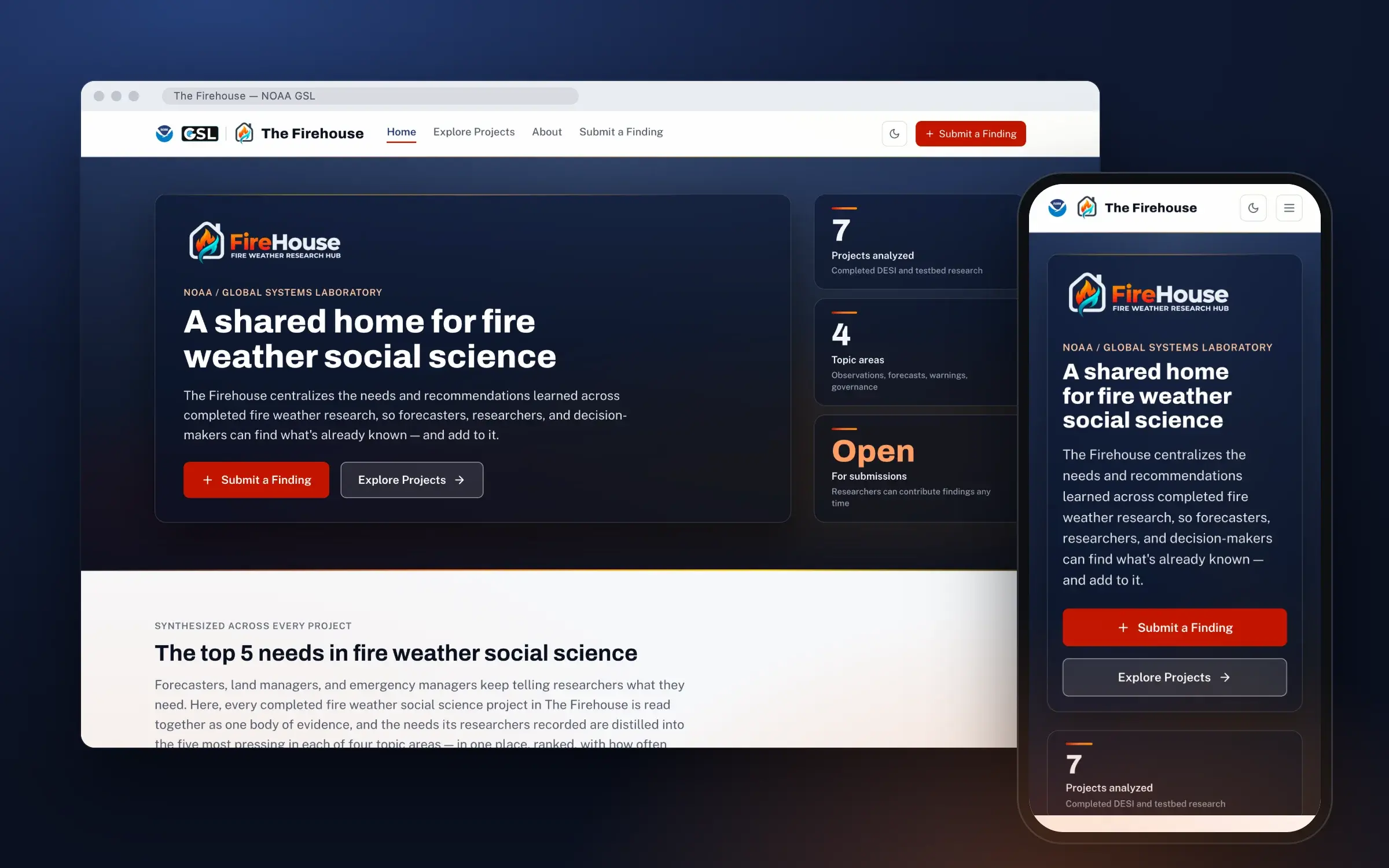
The landing page on desktop and phone. The project count beside the hero is computed from what is published, so it moves on its own when the next project is added. Captured from the working build.
Outcomes
20
Needs, each traced to its sources
Five per topic area, every one citing the numbered survey entries it counts
7
Projects in researchers' words
Imported from the survey verbatim; the synthesis never overwrites them
0
AA contrast failures
Across every route in both themes and both fallback states, checked against live pages
01 — Problem
Fire weather social science asks a practical question: what do forecasters, incident staff and land managers actually need from weather information when a decision can't wait? A lot of good work has answered parts of it — DESI studies, Fire Weather Testbed evaluations, projects run by individual teams. The findings tended to stay inside the report that carried them. If you wanted to know what was already known, you asked around.
Two NOAA GSL social scientists had already done the hard part. In an internal report called FireHouse 1.0, they ran a thematic analysis across nine completed projects and organized the needs and recommendations into four areas: observations, forecasts, warnings, and governance. My job was to turn that report into a public website, open to researchers outside GSL, that the two of them could keep current on their own.
The brief came with real constraints. The site is a federal resource, so WCAG 2.1 AA and Section 508 are requirements. It launches at the AMS Annual Meeting, which means people will open it on a phone, between sessions. And the audience is mixed — researchers who want the evidence, and leadership who want to see what the program has produced — so it has to read plainly for both.
02 — Research & Discovery
I started from what existed: the FireHouse 1.0 report, the researchers' written requirements, early mock-ups from a designer on the IDSS team, a rough prototype one of the researchers had put together, and the concept slides from the ST Council. I wrote these into a creative brief in July that settled the audiences, the pages, and the open risks — chief among them that an AI tool sorting free-text submissions into topics was unproven and needed a person reviewing it before anything went public.
The most useful research was the walkthrough. In September the two researchers and I walked through the design screen by screen. One comment reorganized the site: projects span multiple topics. The early build filed each project under a topic area, the way the mock-ups had, and a single study about warning coordination genuinely belongs to warnings, governance and forecasts all at once. Filing it under one was wrong; filing it under all of them turned the page into the same handful of reports repeated four times.
So topic areas became a synthesis, not a tag. Projects carry no topic at all. Instead, every need a researcher records is read across the whole collection, grouped into the four areas, and ranked by how many separate entries raise it. The walkthrough set two more rules that shaped everything after: researchers' own words are preserved verbatim on project pages, with the synthesized wording used only where the site speaks for the collection; and every project needs its own address, because researchers cite things.
What the walkthrough settled
Topics are a synthesis across all projects, never a label on one
Researchers' words stay verbatim on project pages; the synthesis appears only on the landing and topic pages
Every project gets a citable URL, with a ready-made citation in a standard format
Search has to handle loose phrases like “smoke and emergency managers”, not just exact titles
Fire cycle phase and completion year are the filters researchers actually reach for
The decision that reorganized the site. Switch between the two models, then pick any need to see the survey entries it counts:
Try it — two ways to organize the same four projects
First synthesis pass · draft · Sep 2026
Observations
Igniting Insight
Igniting Impact
Testbed #002 · Fire detection
Forecasts
Igniting Insight
Igniting Impact
Warnings
Igniting Insight
Igniting Impact
Testbed #003 · Interagency teams
Governance
Igniting Insight
Igniting Impact
Testbed #002 · Fire detection
Testbed #003 · Interagency teams
Four projects become 12 tiles. Igniting Insight and Igniting Impact each touch all four areas, so each appears four times. A forecaster opening Warnings still finds three whole reports to read, and nothing tells them which of the three says what about warnings.
A mention is one need-and-recommendation pair a researcher submitted. The synthesized wording lives only on the landing and topic pages; each project page keeps the researcher’s own words.
03 — Design Process
Project phases — select one
Brief. A creative brief written from the internal FireHouse 1.0 report, the researchers' requirements PDF, early mock-ups and a proof-of-concept prototype. Concept shown to the GSL ST Council.
There was no API to design against. Survey responses live in Qualtrics; the site is a static build. So the boundary between the two is a file contract: an export goes through an import script and comes out as the same JSON the site already reads. Anyone replacing the manual export with a live feed later swaps the left side of that line and nothing a visitor sees changes. The import script is also where the privacy rules live, because it is the one place every answer passes through: contact details are never read, one internal-only survey question never reaches the site at all, a project without IRB approval is reported rather than quietly skipped, and every imported record waits as unpublished until a person publishes it.
The design system arrived as a set of components from the landing page design, and I ported thirteen of them to typed React without changing how they look. What I did change was how they behave. The header was one row that overflowed below about 900 pixels, so it gained a mobile drawer. The project detail panel became a real dialog with focus moved in, trapped, and returned. Route changes move focus to the main content — except on first load, where doing so would put the skip link behind the reader and make it unreachable.
The visual direction is translucent panels over a warm, bounded backdrop, and that is exactly where contrast usually fails quietly. The rule I held to was that glass provides depth, never contrast: every panel's opacity is chosen so text passes against the worst-case composite, and reduced transparency, increased contrast, and browsers without backdrop blur all fall back to opaque surfaces. Two audits check it — a script over the token palette, and a walk of the live page that reads computed colours off real elements — and they catch different things. One was a bug no token audit could see: a light-mode fix that leaked into dark mode through equal CSS specificity, painting every caption on the site below 2.8:1.
What happens to a researcher's answers between the survey and the page. Step through it, then try it without IRB approval:
Try it — follow one submission to the page
Illustrative response · real rules
Field
Answer
In the export
Contact email
researcher@example.gov
present
Job title
Research scientist
present
Project title
Smoke forecast use among incident meteorologists
present
Regions (Q1)
RMCC, NATIONAL
present
Needs & recommendations
Need for smoke timing guidance among IMETs: …
present
How results were shared (Q10)
Briefed at a regional workshop
present
Paper link
https://doi.org/10.…
present
A researcher answers the survey in their own words. Everything below is in the export.
04 — Solution & Outcome
The landing page leads with the answer. Below a short introduction and three live stats sit the four topic areas, each showing its top five needs with how many times each came up. The stats are computed from published content rather than typed into it: an editor controls the wording, but can't put the project count out of step with the projects actually on the site. A label beside the needs says they are AI-synthesized, how many projects they draw on, and — until a person on the team signs off — that they are a draft.
Each topic page carries the same five needs with the projects each one draws on, linked. Each project page is the researcher's record in their own words: abstract, takeaways, needs and recommendations, and papers resolved from their DOIs, with an at-a-glance sidebar and a citation block in APA 7, Chicago or BibTeX, ready to copy. The explorer searches title, abstract, needs and takeaways with typo tolerance and no third-party library, filters by fire phase, coordination area, year and project type, and keeps every choice in the address bar so a filtered view can be pasted into an email.
The coverage map shows where the research comes from, by Geographic Area Coordination Center. Regions are stored as the survey's codes rather than its labels, so rewording a label can never break the map. There are fourteen values, not ten: Hawaii and the Pacific have their own because the official boundary file folds them into Northern California, and National, International and Not sure exist so a researcher can pick the true answer instead of the nearest wrong one. The list beside the map is the operable surface — real buttons with real counts — and the map canvas is hidden from assistive technology rather than offering a screen reader a pile of unlabelled shapes.
Key design decisions
Needs, not projects, are the organizing idea — and every need names the work it came from
AI provenance on the surface: what was synthesized, from how many projects, and whether a person has reviewed it yet
Researchers' words are never paraphrased on their own pages
Counts are derived from content, so they cannot drift from what is published
Every view that can be shared is a URL: a filtered explorer, a selected region, a single project
Glass provides depth, never contrast — with opaque fallbacks for three accessibility and browser conditions
The only runtime third-party call is the basemap, and the map still draws its boundaries without it
The coverage map counts research by fire coordination area. Turn the national rule off to see the map it replaced, and pick any area to see what is filed there:
Try it — one counting rule, two maps
7 published projects · Sep 2026
Not on the map
/?region=AICC
3 projects in Alaska
Igniting InsightNational2025
Igniting ImpactNational2026
NGFS for Predictive ServicesNational2025
Every area shows the research that speaks to it, and each national study wears a label so a regional reader can tell the two apart. The note above the real map says how many national studies are folded into each count. Every count is also a number in the list beside the map, so colour is never the only way to read it.
Three places the design system's own tokens fell short of AA, and what changed:
Three tokens that missed AA
7
Projects analyzed
Completed DESI and testbed research
Light theme4.07:1 fail
12px captions — stat labels, result counts, “last reviewed” lines
#717A8A on #F7F8FA
+ Submit a Finding
Dark theme2.84:1 fail
The “Submit a Finding” button — the most important control on the site
#FFFFFF on #F2762E
Phase: During ×
Dark theme1.39:1 fail
Selected filter chips in the project explorer
#FFFFFF on #B3E1FF
The corrections live in one override file rather than in the ported tokens, so the design system can be re-synced without losing them and the delta can go back upstream as a single change.
The build, page by page:
Top needs
Four areas, five needs each, ranked by how often they came up. The label above them says they were AI-synthesized and from how many projects — the first thing a careful reader will want to know.
Topic page
Each need lists the projects it draws on, one click away. The provenance line names the state of the synthesis plainly: a draft, pending the research team's review, and when it was last updated.
Project page
The researcher's own record, verbatim, at an address of its own. The citation uses the paper's DOI when there is one and the page's address when there isn't, in APA 7, Chicago or BibTeX.
Explorer
Search and filters on desktop, and the same explorer on a phone with the filters folded away. Every choice lives in the address bar, so a filtered view is a link someone can send.
Coverage
Rocky Mountain selected. The list on the right is the real control and the map follows it; national studies are counted in every area and labelled as national wherever they appear.
At AMS, on a phone
The design arrived as a desktop layout. The navigation drawer and the folded filters were added so the site holds up for someone opening a link between conference sessions.
05 — Team & Collaboration
The team
5
DAdesign and build lead: layout, visual design, information architecture and the front endMe
NG2 NOAA GSL social scientists — the research, the requirements, and the content after launch
DF1 designer from the IDSS team — early mock-ups, and the live data integration after handoff
GW1 GSL web and IT lead — hosting and placement within GSL's web presence
The two social scientists who own the research are also the site's editors, so most of my design reviews were with the people who will run it. We worked in review sessions: they went through the design screen by screen, said what was wrong, and I rebuilt against the notes. The site is written so the handoff is a clear line — I build the interface and a file contract it reads from, and the integration that replaces the manual survey export with a live feed sits on the other side of that line without changing anything a visitor sees.
06 — Reflection
The most important design work here was deciding what the site is about. The brief described a hub of projects. The walkthrough showed that a reader doesn't come for a project; they come with a question about warnings, or forecasts, and want to know what the evidence says. Moving from filing projects to synthesizing needs changed the information architecture, the data model and the landing page, and it is the reason the site is more useful than the folder of reports it replaces.
The second lesson is about putting AI-made content in front of the public. The synthesis is genuinely useful and genuinely unreviewed, and both of those facts belong on the page. Labelling it as AI-synthesized, counting what it was drawn from, marking it as a draft until a named person reviews it, and linking every need back to the researchers' own words costs a line of interface and earns the trust a government research site depends on.
Next is launch. GSL is settling where the site will live, the researchers are choosing a CMS behind content adapters that are already written, and the first synthesis pass is waiting on their review. A full screen-reader audit and the remaining federal checks come before the site goes public at AMS in January.