Brand & Print — Identity Systems, Guidelines, and Collateral
Wicked Oni studio clients · NOAA GSL · Tigerpaw
BrandGraphic DesignPrintIllustration
Identity and print work from Wicked Oni, the studio I've run since 2015, and from inside organizations with brands of their own. Three complete brand systems with written guidelines, label and packaging work, marks for NOAA programs, logos for food, retail, and outdoor brands, illustration and art prints, and campaign art for a software company, down to the flyers and posters.
Role
Brand & Graphic Designer
Timeline
2015 – present
Team
1, plus each client
Client
Wicked Oni studio clients · NOAA GSL · Tigerpaw
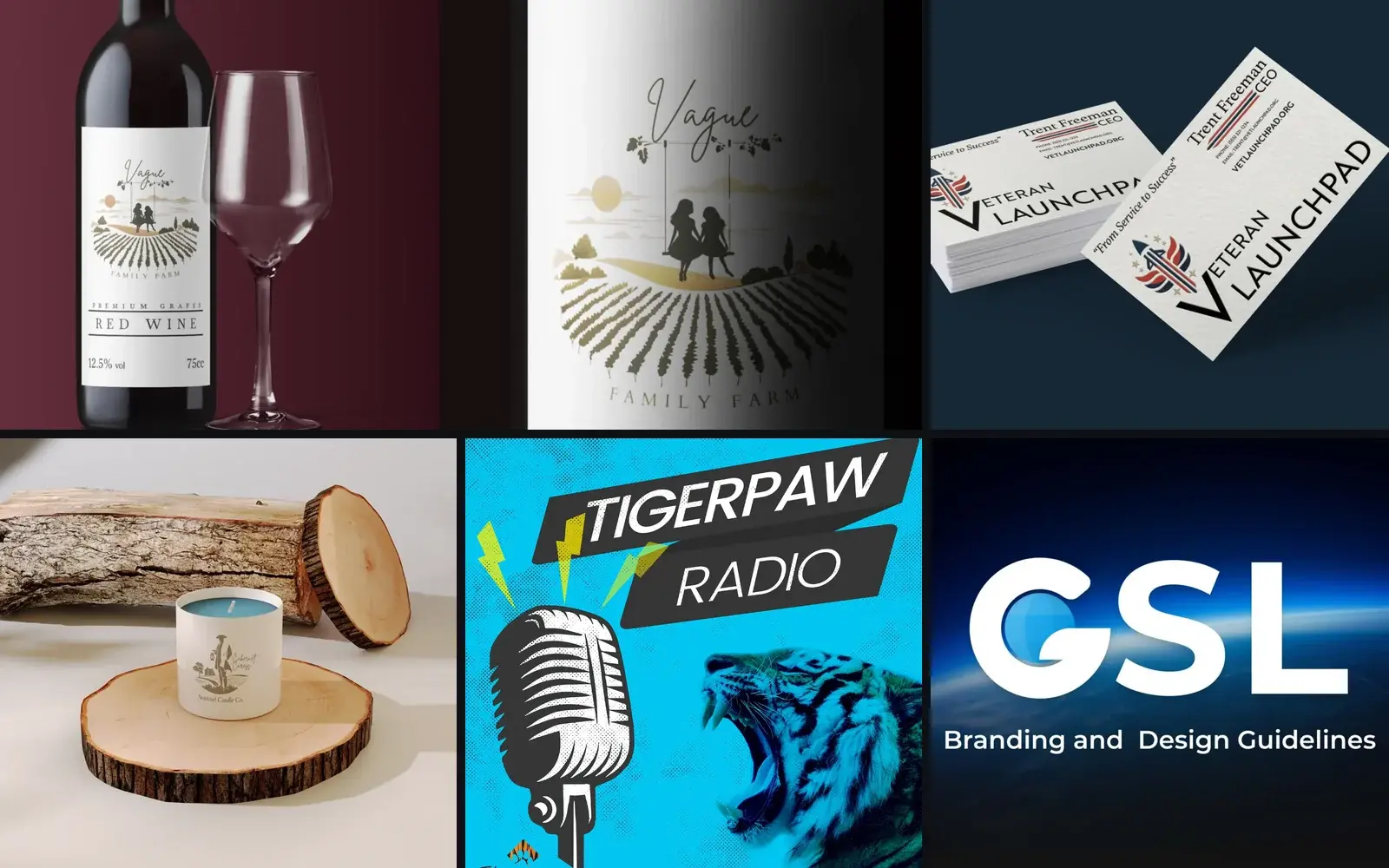
Label, card, jar, podcast cover, and a federal lab's standard. Each identity is shown on the surface it was designed for, which is how the clients chose them.
Outcomes
3
Brand guideline documents
Vague Family Farm (12 pages), Veteran Launchpad (10), and the NOAA Global Systems Laboratory (13)
27
Marks and identities shown
From a family farm and a NOAA atmospheric profiling system to a skate shop, a chocolatier, and two hot sauces
2,015
Studio founded
Wicked Oni, my independent brand and product design studio
01 — Problem
A small business meets its brand one surface at a time. The logo gets made for the website, then someone needs a wine label, a sign by the road, a business card, a candle jar, and each vendor redraws it a little. A year later the business has four versions of itself and no way to say which one is right.
A larger organization has the opposite problem. The NOAA Global Systems Laboratory had no single standard for how the lab's mark, color, gradients, type, and imagery should look.
Both problems have the same answer: a mark that holds up everywhere it lands, and a written standard that lets someone who wasn't in the room apply it without guessing.
02 — Research & Discovery
I start with the business, not the logo. Aerial Vues was a veteran-owned drone photography company in Jacksonville, Florida, built on former U.S. Naval Aviators bringing their flying to civilian drone work. Before any mark was drawn, I worked with the founder on the company's name and personality, then built the logo, digital assets, and website from that.
The second question is where the mark will actually live, because that decides what it has to survive. Vague Family Farm needed a wine label and a wood sign. Sentinel Candle Company needed to read on a candle jar. Veteran Launchpad needed business cards and a mark that could carry the weight of military insignia for an organization helping veterans into their next chapter.
For the Global Systems Laboratory, the standard had to cover more than the logo. A federal lab publishes constantly, so the guidelines also set rules for image naming, alt text, file types, attribution, and licensing, the places where a brand quietly falls apart in practice.
What I ask before drawing anything
What does the business do, and who is it for?
Where will the mark be printed, stitched, carved, or shown on a screen?
Will it ever run in one color, or at favicon size?
Who applies the brand after I'm gone, and what do they need written down?
Is there an existing standard this has to live inside?
03 — Design Process
Project phases — select one
Listen. What the business is, who buys from it, and every surface the mark will live on: a bottle, a road sign, a candle jar, a business card, a website header.
Clients get real directions, not one answer and a pitch. For Vague Family Farm that meant an illustrated scene, two girls on a swing hung from a branch over rows of crops, against a simpler one-color badge. For Sentinel Candle Company, two illustrated directions built around a lantern-carrying sentinel.
Then every direction goes into context. I put the Vague mark on a wine label and a wood sign, the Veteran Launchpad mark on business cards, and the Sentinel marks on candle packaging, so the client judges each option where a customer will see it, not on a white artboard.
Once a direction is chosen, it gets the variations that keep it alive in the real world: a monochrome version, color and one-color versions, alternate lockups, and a standalone mark when the wordmark won't fit. The Gardner's Inc. got its G as a mark on its own.
Last comes the written standard. Each palette color gets a name, a hex value, a Pantone match, and a stated use. Each typeface gets a job. The rules are written for the next person who touches the brand, not for the client presentation.
Directions and variations, from exploration to final. Click any of them to look closer:
Direction 1 · Vague Family Farm
The illustrated direction. The swing carries the family story, and the crop rows give the farm a horizon without a literal barn.
Direction 2 · Vague Family Farm
The alternate: a one-color badge built for stamps, stitching, and small sizes.
Variation · monochrome
The chosen mark in monochrome, for single-color print runs and any time it has to sit on a photograph.
In context · Sentinel Candle Company
Both Sentinel directions went onto candle packaging before the client chose, so they judged the mark on the shelf, not on an artboard.
04 — Solution & Outcome
Vague Family Farm got two logo directions, a monochrome version, and a 12-page guidelines deck. The palette names five colors (Heritage Green, Olive Grove, Harvest Gold, Sandstone Beige, and Morning Mist) with Pantone matches and a job for each, set in a Brittany script and Cardo serif pairing and shown on a wine label and a wood sign.
Veteran Launchpad got an emblem, a rocket flanked by striped wings under a ring of stars, plus a horizontal combination mark and a 10-page guidelines deck under the line "From Service to Success." The palette is built on Command Navy, Bravery Red, and Valor Gold with Pantone references, supported by a secondary set of neutrals, with Brother 1816 for display and Athelas for text.
The NOAA Global Systems Laboratory got a 13-page branding and design standard: the GSL combination mark and its clear space, primary and secondary palettes with Pantone values, three named gradients (Arctic Dawn, Horizon Blue, and Deep Current) with do and don't rules, a Montserrat and Nunito Sans type scale, and the image rules above. I also designed marks for lab programs and tools, including CLAMPS, the Fire Weather Testbed, and the NWS Aware app icon.
At Tigerpaw Software I designed marketing campaigns in print and digital, including the Family Rewards referral program, podcast art for Tigerpaw Radio, campaign illustration, and the MPS Insiders program mark.
Beyond the full systems, the wall below carries standalone logos for food, retail, education, and outdoor brands, and illustration work: art prints for Loveland, Colorado, tarot and poster art, apparel graphics, and studies in linocut, paper, and low-poly styles.
What a finished identity includes
A primary mark plus the directions that led to it
Color, one-color, and monochrome versions, and alternate lockups
A named palette with hex and Pantone values and a stated use for each color
A type pairing with rules for headings, body, and accents
Mockups on the real surfaces: labels, packaging, signage, business cards
A guidelines document the client can hand to any vendor
Everything else on one wall. Filter by type, then open any piece at full size:
Vague Family Farm
Primary mark
Vague Family Farm
Wine label
Vague Family Farm
Wood sign
Vague Family Farm
Second direction, one-color badge
Veteran Launchpad
Emblem
Veteran Launchpad
Combination mark
Veteran Launchpad
Business cards
Sentinel Candle Company
Lantern-carrying sentinel
Sentinel Candle Company
Candle packaging
Sentinel Candle Company
Product shot
The Gardner's Inc.
Logo
The Gardner's Inc.
Standalone mark
NOAA Global Systems Laboratory
Lab combination mark
NOAA CLAMPS
Mobile atmospheric profiling system
NOAA Fire Weather Testbed
Program mark
NWS Aware
Forecaster app icon
Blackline
Communications app logo
Aerial Vues
Logo, veteran-owned drone photography
Orion Realty
Logo
Tigerpaw Software
MPS Insiders program mark
Alpine Coast Skate Shop
Logo
LavaLamp Design Studio
Studio logo
Loveland, Colorado
City badge
Spice & Bean Chocolates
Logo
Rocky Fire Sauces
Logo
Colorado Hot Sauce
Logo
Skyward Flight Academy
Logo
Skate Denver
Logo
Book Hive
Logo
Great Wave
Logo
Ramen
Logo
Clementine
Logo
Design Evolution
Logo
Memento Mori
Logo
EclipseCore
Logo
Loveland, Colorado
Art print
Art print
Open Book with Flowers
Art print
Let Forever Be
Tarot illustration
The Lovers
Illustration
Low-poly ram
Illustration
Paper fox
Illustration
Punk skull
Art print
Peace
Illustration
Skeleton rose
Apparel
Great Wave shirt graphic
Poster
We Are the Monsters
Poster
Clutist
Illustration
Line emblem
Illustration
Organic cloud
Tigerpaw Software
Family Rewards flyer
Tigerpaw Software
Family Rewards, printed
Tigerpaw Software
Tigerpaw Radio podcast art
Tigerpaw Software
Campaign illustration
Tigerpaw Software
Campaign illustration
Tigerpaw Software
Type pattern
Original Zen
Services flyer
Back to School Bake-Off
Event poster
Wine label
Illustrated label
Orion Realty
Business card
The finished systems, page by page:
Vague Family Farm · palette
Five named colors pulled from the land the farm sits on, each with its hex, Pantone match, and a stated role.
Vague Family Farm · type
Brittany for the name and signature moments, Cardo for everything that has to be read.
Vague Family Farm · signage
The detailed illustrated mark still reads when it is carved into wood.
Veteran Launchpad · combination mark
The emblem nests into the V of the wordmark, so the horizontal lockup reads as one piece.
Veteran Launchpad · palette
Command Navy, Bravery Red, and Valor Gold, each named for what it means to the people the organization serves.
Veteran Launchpad · type
Brother 1816 for headlines and the wordmark, Athelas for longer reading.
NOAA GSL · combination mark
The lab's mark, its clear space, and the rules for scaling, color variation, and prohibited uses.
NOAA GSL · color and gradients
Primary colors with Pantone values, and three named gradients (Arctic Dawn, Horizon Blue, Deep Current) with their exact stops.
NOAA GSL · type scale
Montserrat for display and headings, Nunito Sans for body, with every level specified so a web team can build it straight from the page.
NOAA GSL · image rules
The part most brand books skip: file naming and alt text, with good and bad examples, followed by file types, attribution, and licensing.
05 — Team & Collaboration
The team
1, plus each client
DAdiscovery, illustration, logo directions, color and type systems, mockups, guidelines, and print-ready filesMe
OAOwners and founders on the studio work, choosing between directions and approving the final mark
IDInternal departments at Tigerpaw Software, who briefed the campaign and marketing art
TNThe NOAA Global Systems Laboratory, for the lab standard and the program marks
Most of this is solo studio work for businesses without a marketing department. That shapes the handoff: the owner leaves with files and a guidelines document they can give a printer, a sign shop, or the next designer without calling me. The rest was done inside someone else's system. At Tigerpaw I made campaign art under an existing brand, and at Anheuser-Busch I built a product identity (primary logo, mark, color variants, favicon) within AB's corporate guidelines. Knowing when a standard should hold and when it's worth pushing is the same skill in both settings.
06 — Reflection
A mark on a white artboard is an abstraction. On a bottle or a candle jar it is a decision a client can actually make, so I show context early, before anyone gets attached to a direction.
Guidelines are written for the person who wasn't in the room. A printer, a sign shop, or a new marketing hire needs the Pantone number and the rule, not the story of how we got there. The best test of a standard is whether someone can apply it correctly without calling me.
Working inside someone else's brand, at Tigerpaw, Anheuser-Busch, and NOAA, taught me the other half of the job. Most of the time the standard should hold, and the work is making something good within it. Knowing which moments deserve a push is the judgment clients are really paying for.